Luomunen - visual brand identity as a personal project
Luomunen is an imaginary delivery company that delivers organic food to local customers.
Client: Luomunen Project: To design an imaginary brand with visual identity Date: Winter 2025
Pain points
Luomunen – a brand with no visual identity and has a growing customer base, so the visuality was a must have. The brand had the need to differentiate from other competing delivery brands, maintaining the brand’s core values and personality.
The task
I wanted to create an imaginary brand and design a visual identity for it, for training purposes. Visual identity creation excites me, and inspired by many other design portfolios online, I wanted to design one myself.
Process
While brainstorming ideas, I decided to ask for help from ChatGPT with ideating the brand’s story and main profile. The ideas turned out suggesting a organic food market with the name Humble Harvest. With a little tweaks I came up with the name Luomunen, which was inspired by the word “luomu” from finnish language, meaning organic food.
The business idea of the company was also to change, as I had this idea of a food delivery brand. But how Luomunen is different from competitors Wolt or Foodora?
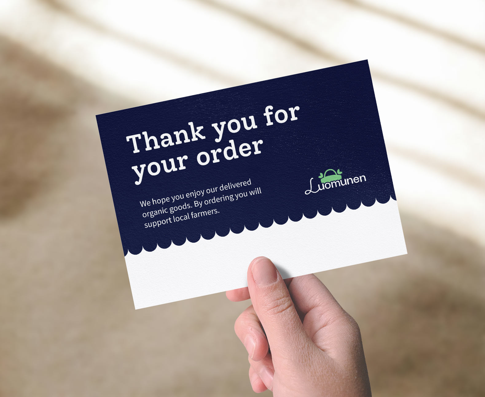
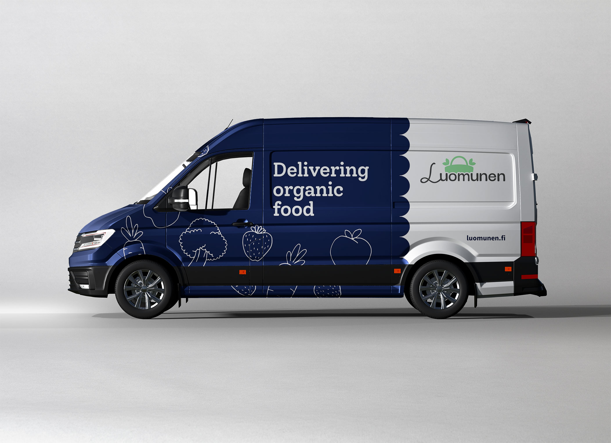
Luomunen delivers only locally produced organic groceries and goods.
The deliveries are driven with electric vehicles, so that the carbon footprint would be smaller.
Brand fundamentals
After the brand name and purpose had been established, next up was fundamental work. This consisted:
Mission, vision
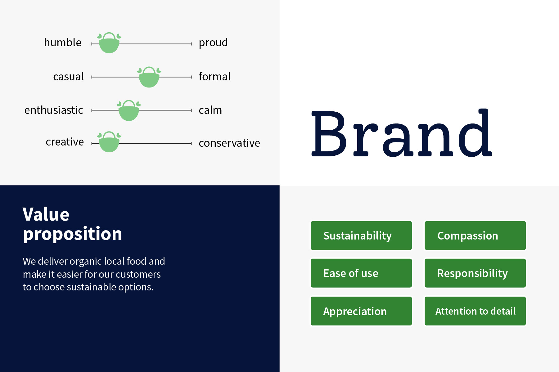
Brand personality
Values
Value proposition
Moodboard
Luomunen thrives at getting customers easier access to sustainable food. Ecology is important for the brand and it makes environmental compensations.
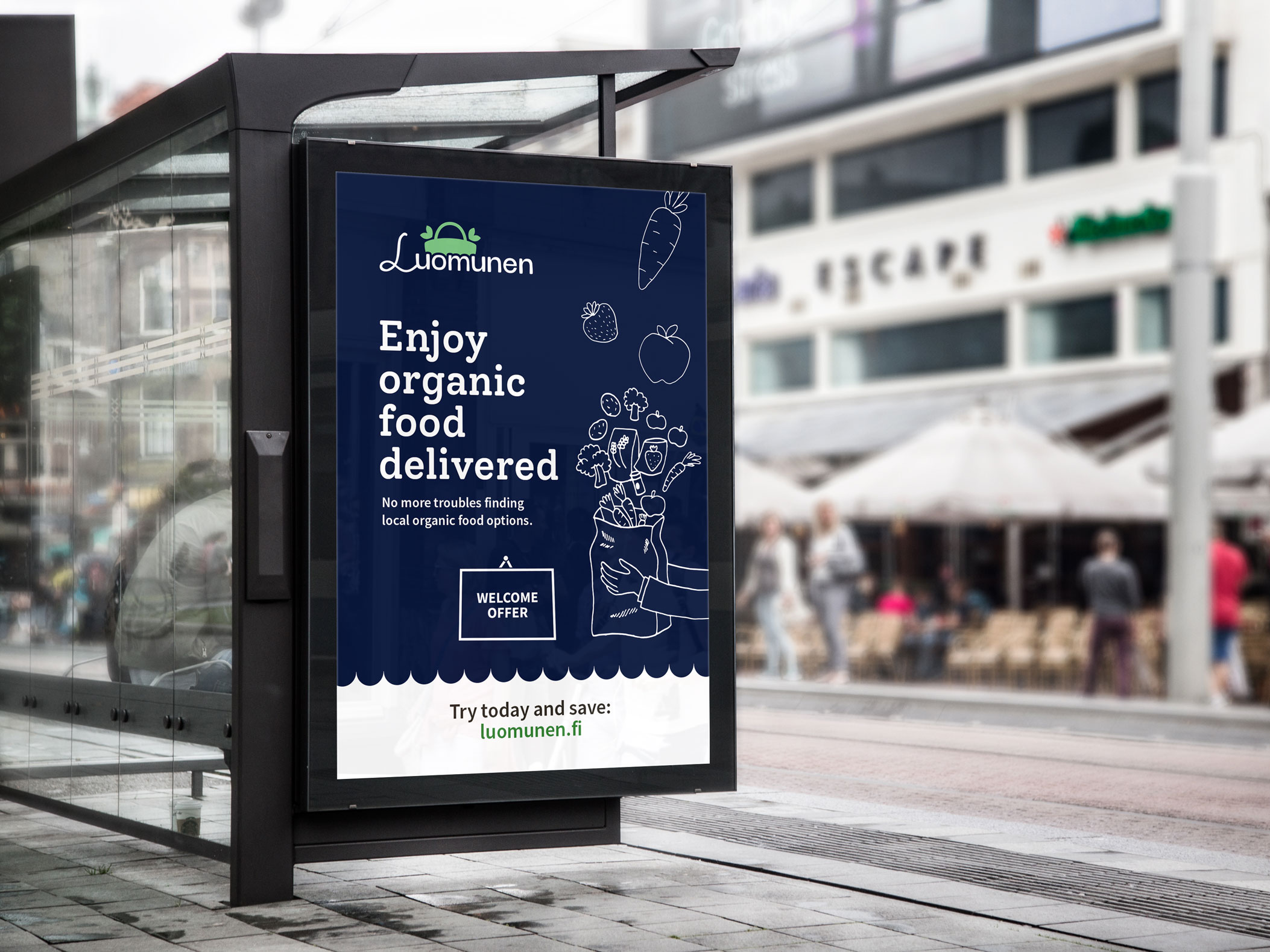
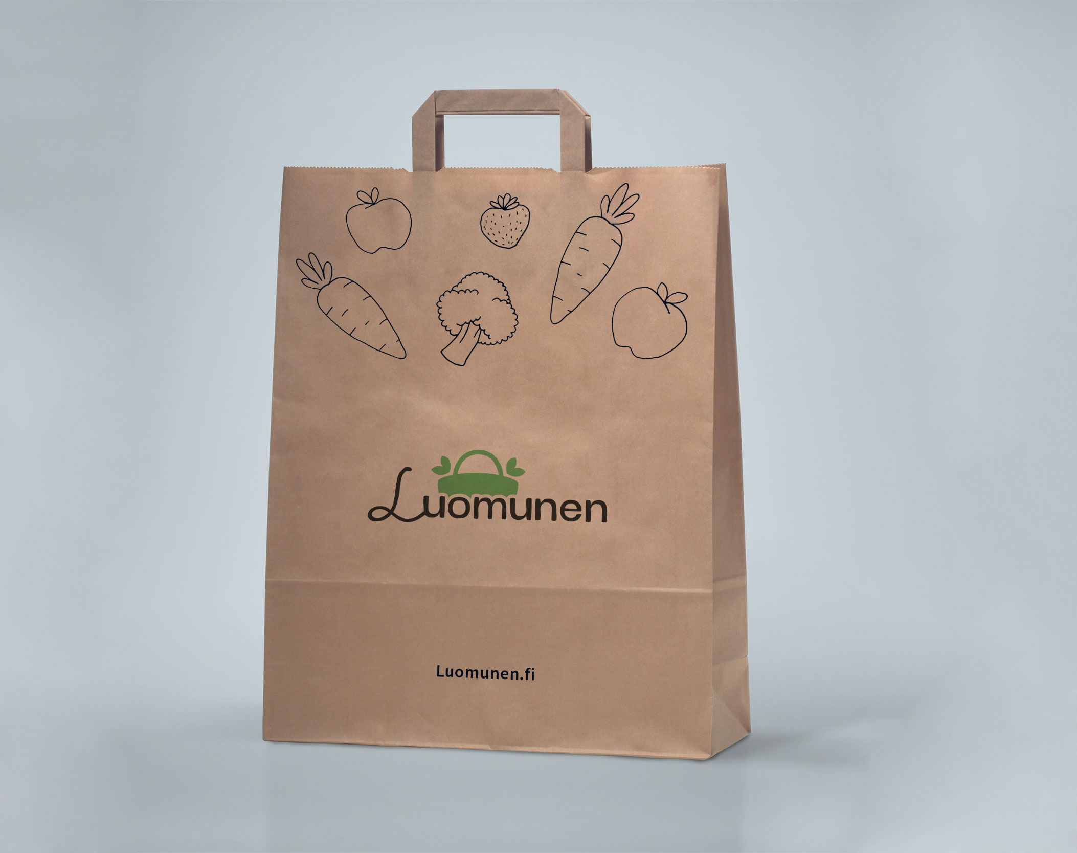
Brand visuality
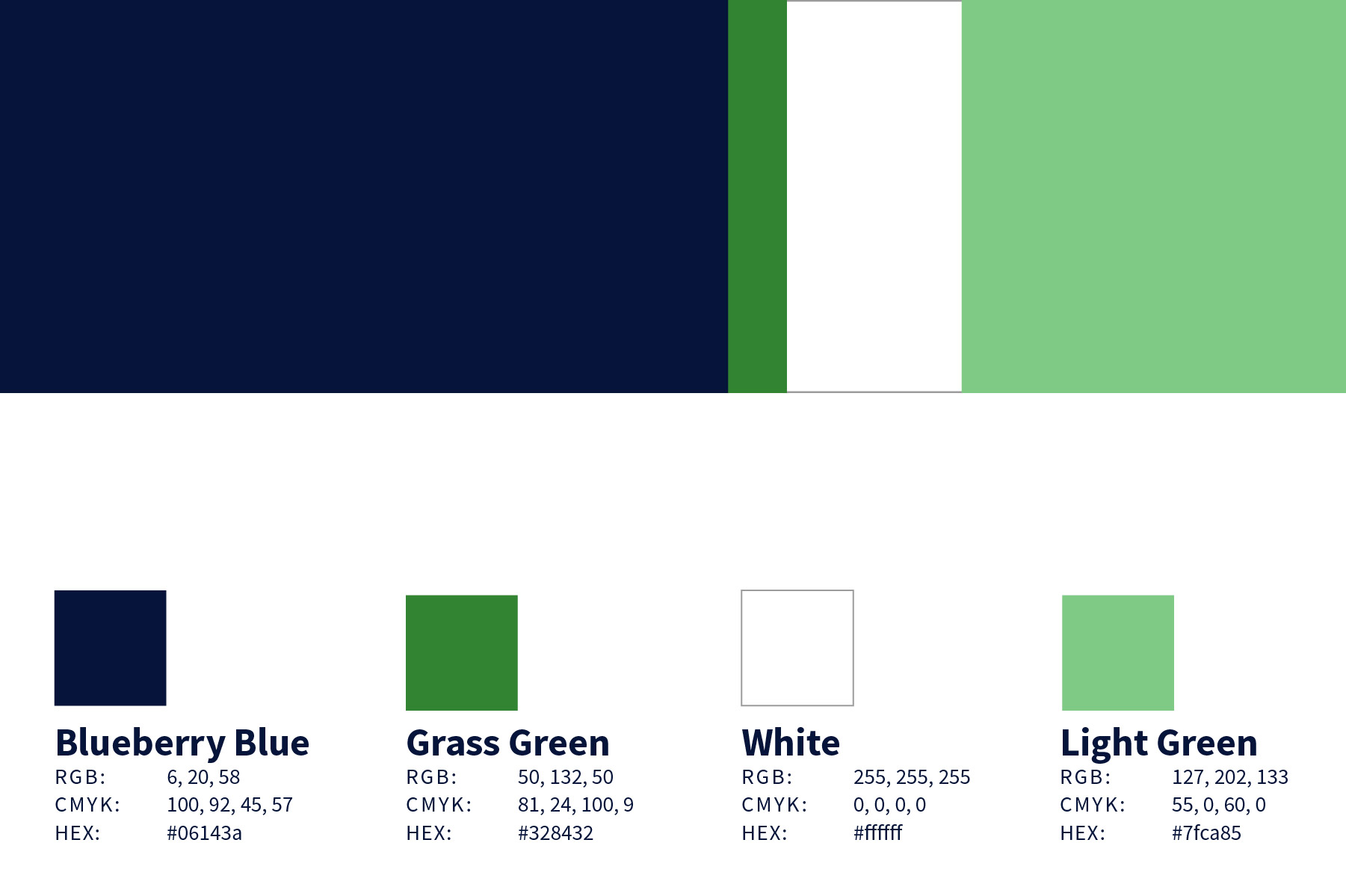
The brand’s colour palette gets the inspiration from the nature, but instead of earthy tones the colours are more lively. Blueberry Blue is used primarily as an emphasis background. One can design White and Light Green elements on top of the blue. Grass Green is reserved for the call-to-actions and highlighting.
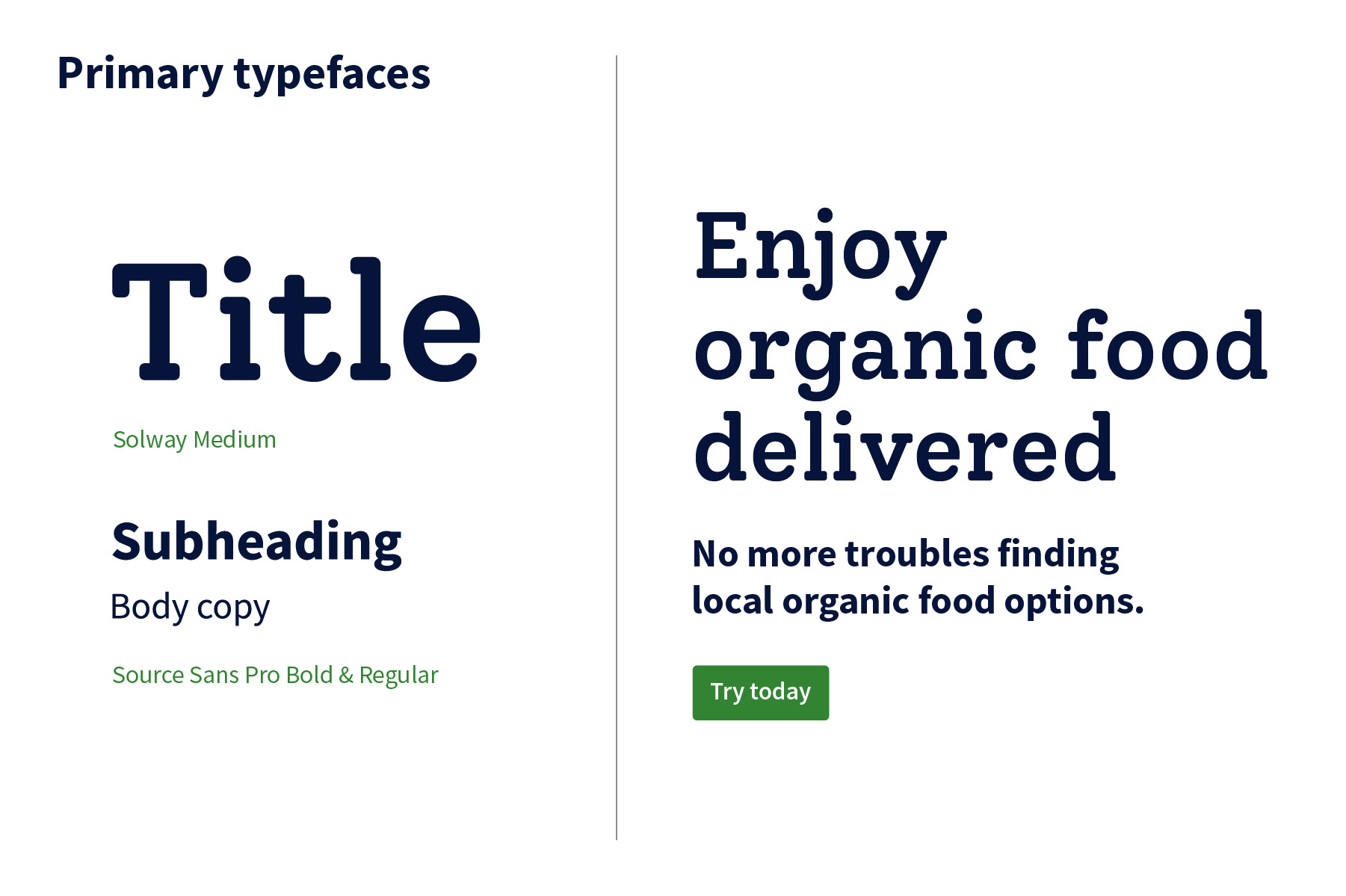
Typography was adjusted to Luomunen’s personality. With the bold and playful Solway in headings and professional Source Sans Pro in other copytext, the entity is coherent and memorable.
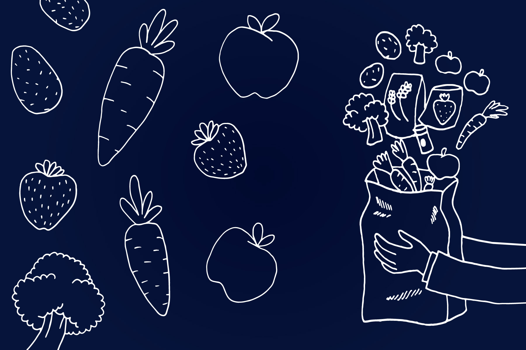
I designed brand illustrations as well to work with the visuality. The key idea was to illustrate the goods Luomunen delivers. I got inspiration from photography with chalkboard drawings, and wanted to maintain the hand drawn look and feel.
Key takeaways
After finishing the visuals I was happy to see that I can design a brand from scratch. In the beginning it was a bit of a struggle for building the moodboard, as it and the final visuals look nothing similar. That’s something I would explore more, and also to learn how to match the visual idea core to final results.
Additionally, I found Youtube videos very useful figuring out the themes of my project brand. There are many content creators focusing on graphic design, and they are very inspiring to watch.
All in all, this project was very educational, and was an actual boost for my designer confidence. I really do hope that I get to work on projects like these in the future.
Mock-up and photo credits:
GraphicBurger.com Designbolts.com Pixeden.com Graphicsfuel.com Unsplash / Bree Anne